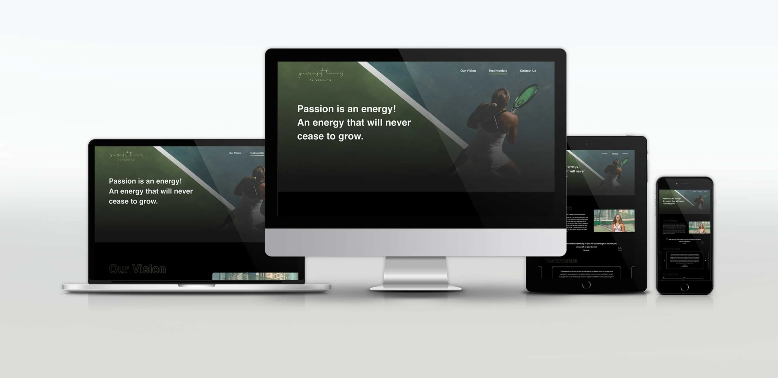
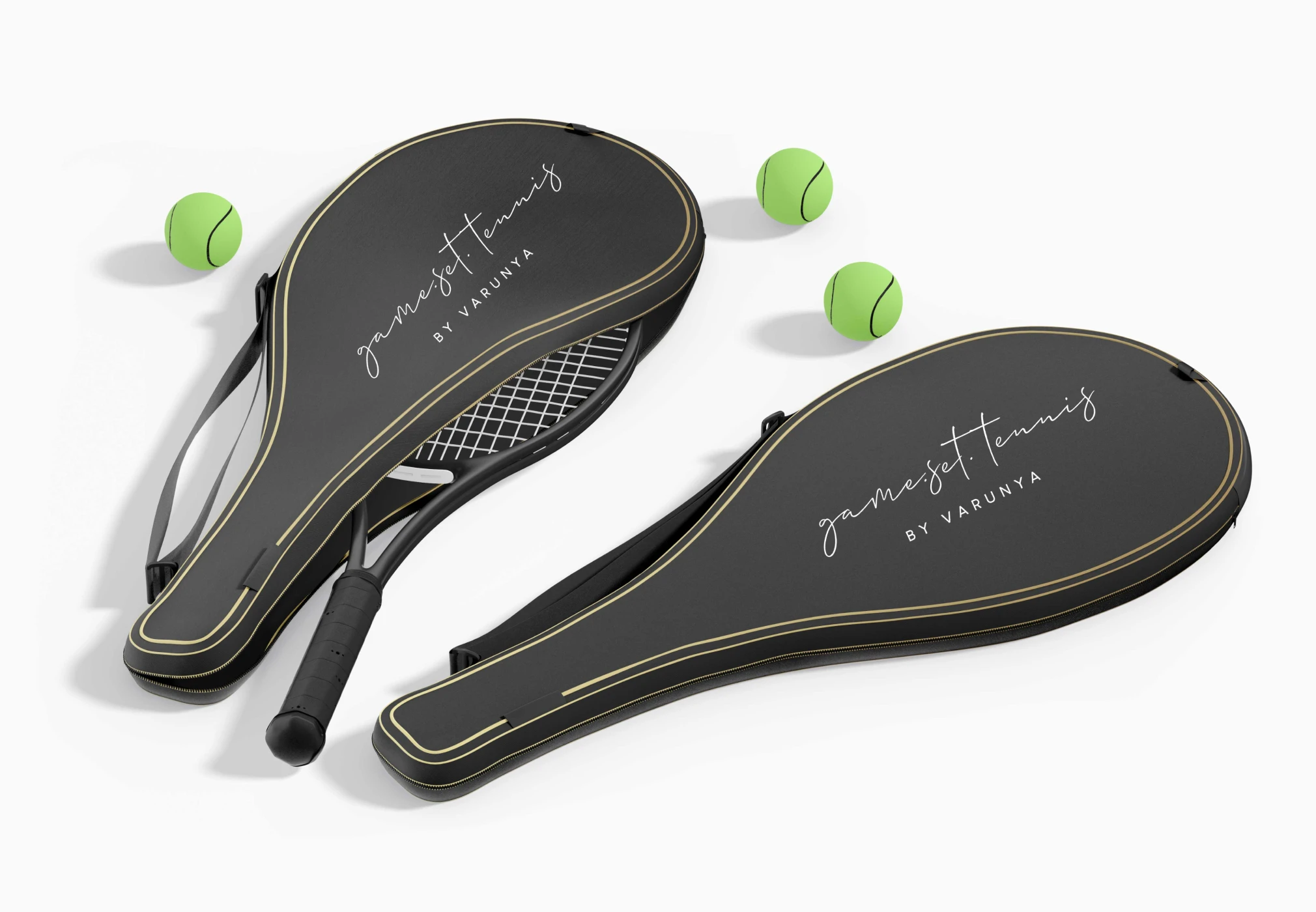
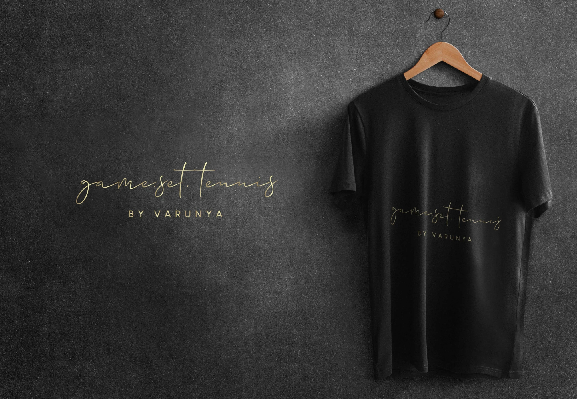
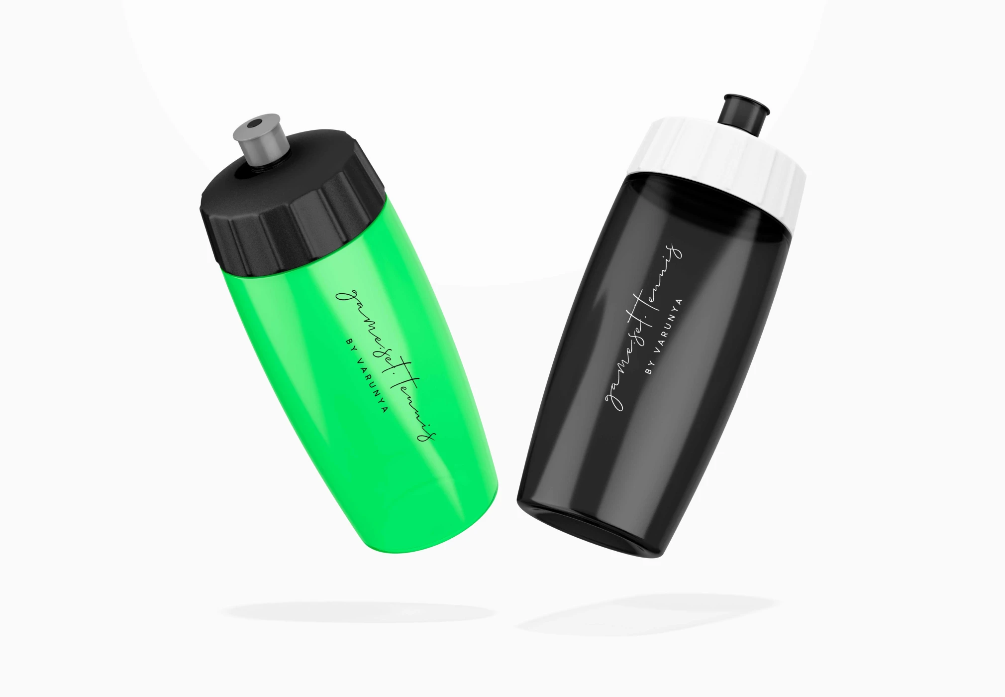
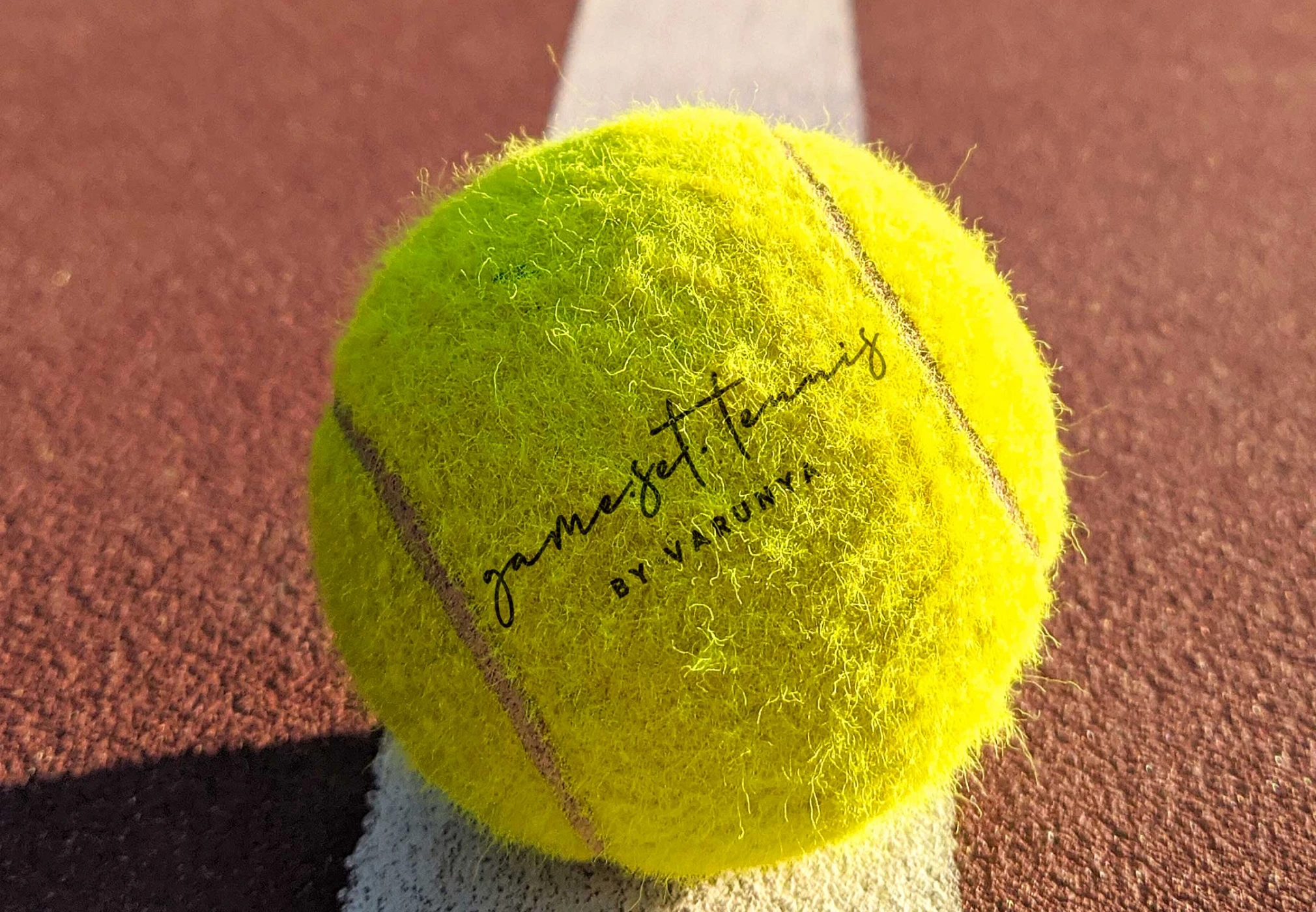
Game.Set.Tennis is a space where passion meets performance. With expert coaching, world-class facilities, and a vibrant community, it fuels every player’s journey—from beginners to pros—with energy that constantly evolves and pushes limits.


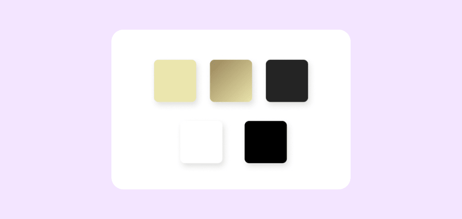
A dark grey base with golden accents lends a regal and premium look to the design. The interface is clean and minimal, focusing on strong visual appeal with an image-oriented layout and limited, purposeful content.
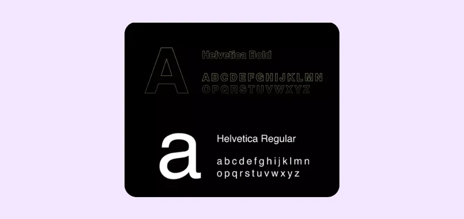
The font used is ‘Helvetica’, a widely recognized sans-serif typeface known for its clean, modern aesthetic. Its simplicity and high readability make it a preferred choice among designers seeking a sleek, contemporary feel.
Development involves building or improving software by defining goals, requirements, architecture, and methodology. Testing ensures functionality and quality, validating the final product to meet stakeholder expectations through efficient quality assurance and risk management practices.


High-quality visuals, responsive layouts, and optimized media assets were used to enhance user engagement, highlight core offerings, and ensure seamless performance across all devices and screen sizes.